Cyndx Redesign
The Cyndx web app is a fintech app used by investors to find companies to invest in. The app had been passed down through several designers with no existing design system, resulting in a jumbled mix of typography, components, and buttons. Since I began working at Cyndx, I have been working closely with the team on building new features, retooling the information architecture, standardizing the styles, and providing a strategy for responsive web (previously not provided by other designers). Here’s a little preview of before and after states. More to come soon.
Before: Finder input page
After: The removal of the page border and double header helps to modernize the app.
Before: Search results page
After: The cohort analytics section is now collapsible and tabs are now clearly aligned with the search results.
Before: Expansion of a company row in the search results page takes up nearly the whole screen.
After: Actions are consolidated within an overflow menu, greatly reducing the space used per expanded row.


Before: Filter panel

After: Updated filter panel with Material Design sliders, updated typography.
design system
I created a design system to standardize the many styles on the app, which is currently being implemented in phases.
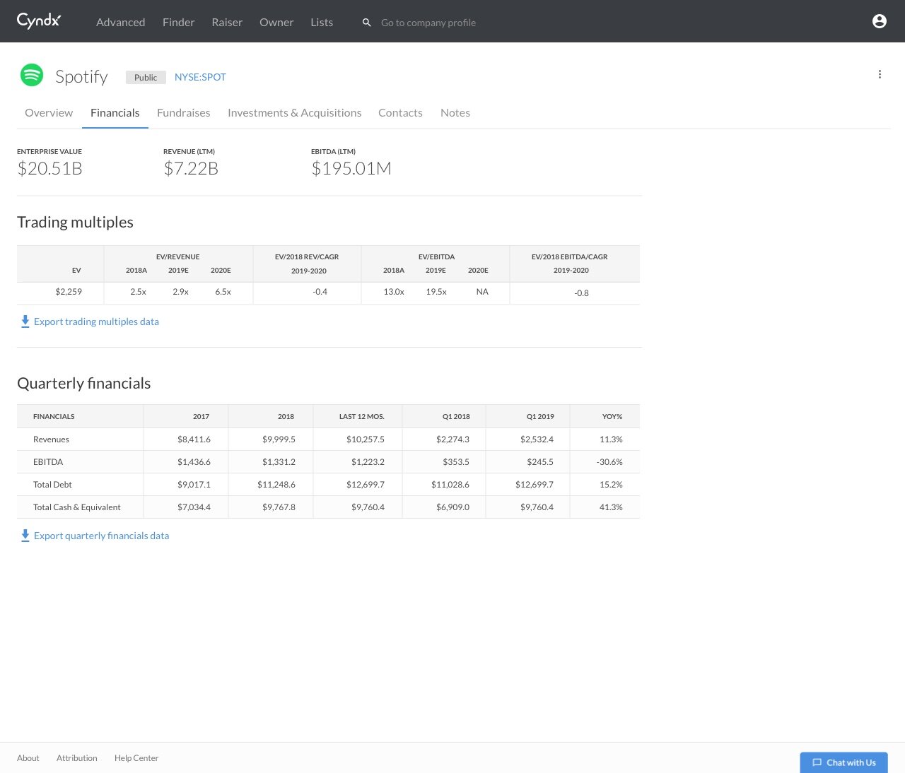
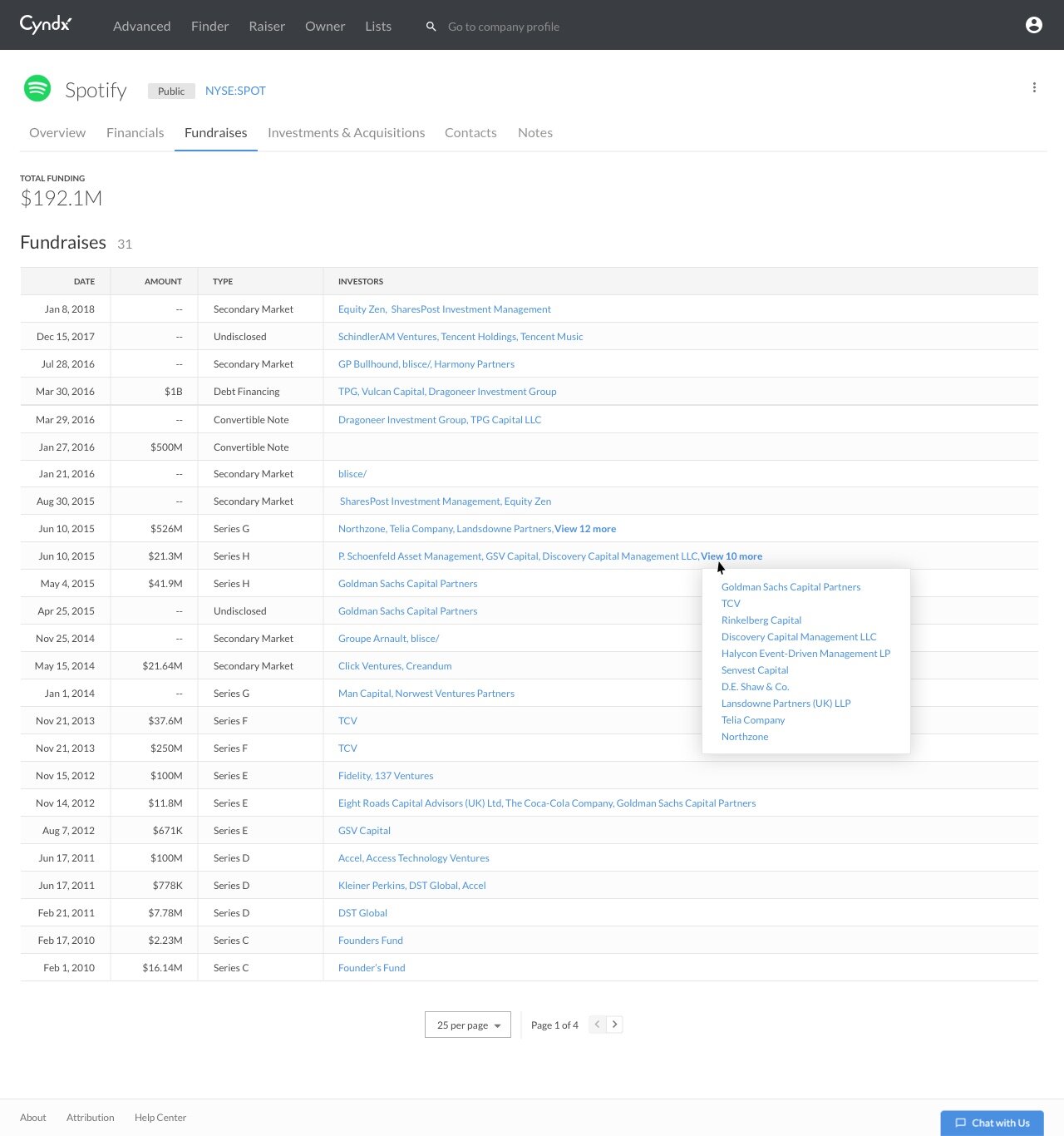
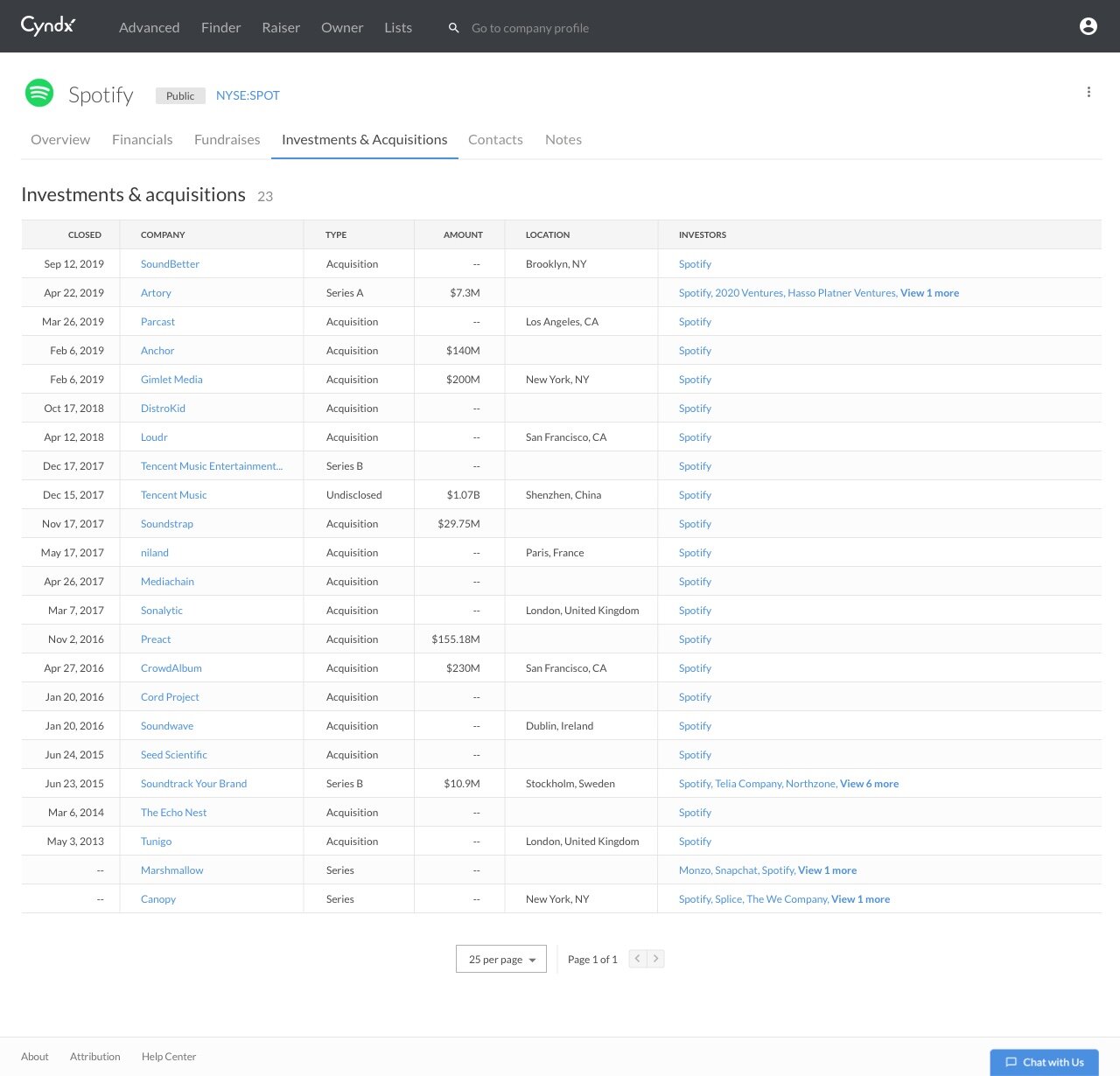
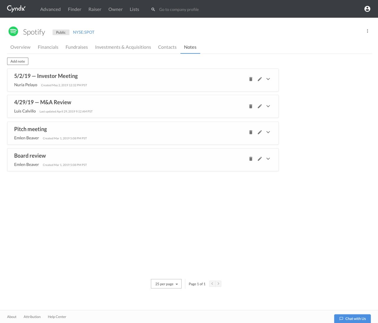
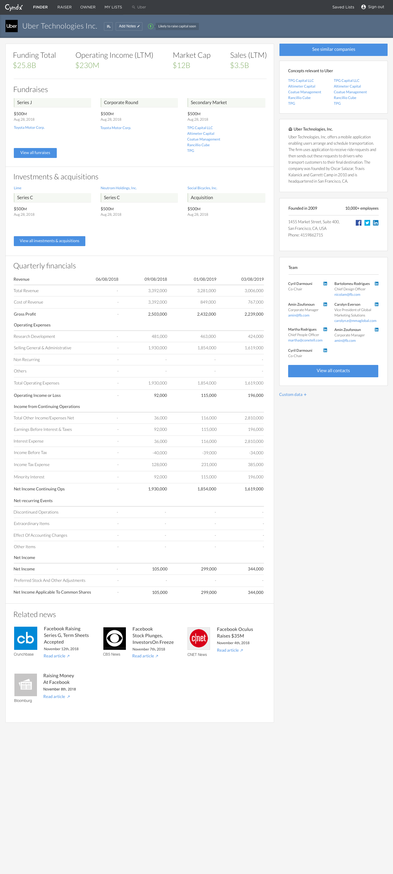
profile redesign
The profile redesign stemmed from customer feedback that we did not have enough information in our app. The information was present, but hidden within modals. I worked closely with the product manager and front end developer to showcase the depth of data on the profile pages through the use of tabs and tables. The last image in the gallery shows the previous profile page.
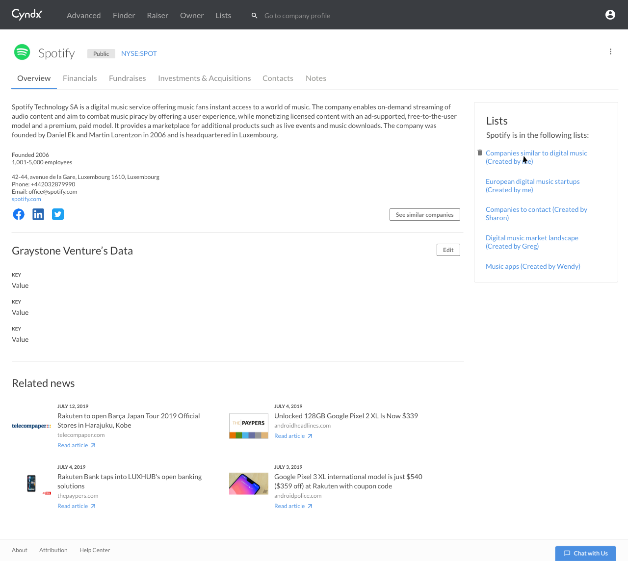
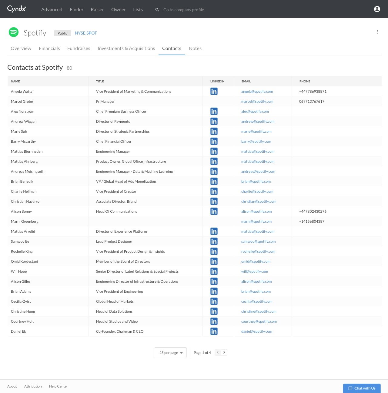
Responsive layouts were provided for the front end developer, with horizontally scrolling table views documented for smaller screen sizes.


Custom comparables
The custom comparables view was built out of a need by investors to see financials for public companies, so that they could easily compare metrics while figuring out which companies to invest in. Since we already had a company list view, we ended up implementing a view switcher, in which the user could easily switch from the company info view to the financial view. For smaller viewports, the tables would scroll horizontally, with the left-most column containing company information locked, so that the user would not lose their place. The filters were also built to be collapsible, so that the user could view more data.
Firmographics view with basic company information
Custom comparables view with financial data

At smaller sizes, the filters panel would be collapsed, and the logo would disappear to accommodate more data in the table

We implemented horizontally scrolling tables at smaller sizes. The left-most column would be locked so that the user wouldn’t lose context.
While building out the Custom Comparables View, we recognized the need to compare companies within the result set directly on the canvas. The use of a “selection toggle” would allow the user to only see rows that they selected. We also added a number count to other elements in the selection bar, so that the user could easily see how many companies were being displayed within the canvas or added to a list.
